In this tutorial we will conduct simple linear regression on a dataset on an example dataset. In the dataset there are 62 individuals, and we will be regressing brain weight over body weight. As stated before, in simple linear regression we are trying to find a linear relationship between the dependent and independent variable, that can be modeled as

The dataset we will be using today was pulled from a set of example datasets, linked in the sample data section. I have hosted it at this website using the following URL, so you may copy and paste the code to follow along.
dataurl = "https://scg.sdsu.edu/wp-content/uploads/2013/09/brain_body.txt"
data = read.table(dataurl, skip = 12, header = TRUE)
If you visit the dataset, you will see the data does not start immediately at the first line. Because it is a text file, I have used the command read.table() to import the data. I use the skip flag to skip the first 12 rows of the file, and then set the header flag to TRUE to ensure that the variable names are taken from the first read (13th) row. So the data starts on the 14th row.
fit1 = lm(Brain_Weight ~ Body_Weight, data = data)
par(mfrow=c(1,1))
plot(x=data$Body_Weight,y=data$Brain_Weight,xlab="Body Weight",
     ylab="Brain Weight",main="Simple Linear Regression (Bad)")
abline(fit1)
par(mfrow=c(2,2))
plot(fit1)
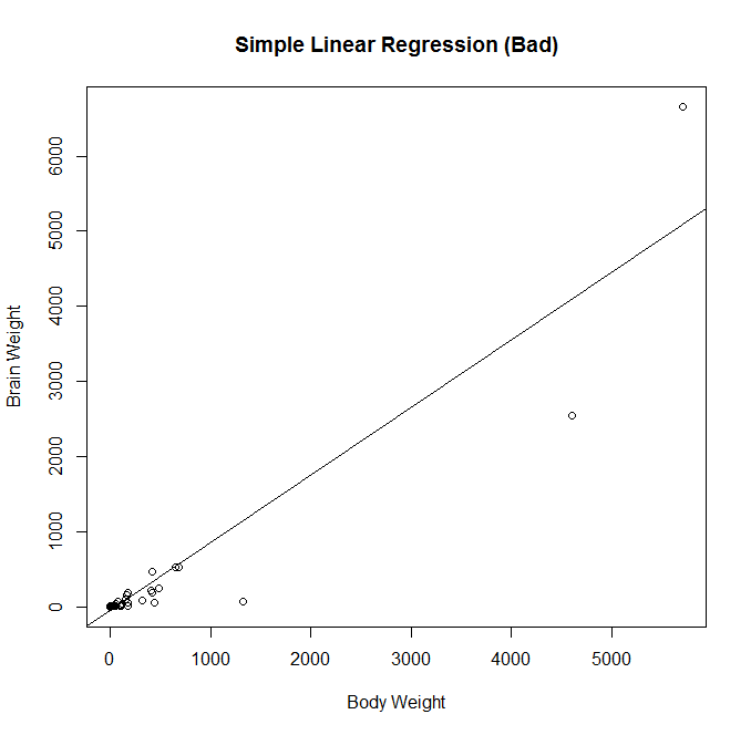 Here I create a preliminary fit, and plot the data to look at it. In fact, it was probably unnecessary to make the preliminary fit, as plotting the data we will see that it is heavily skewed and not a good candidate for regression. Observing the diagnostic plots will confirm this.
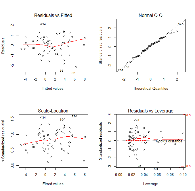
 In looking at the first diagnostic plot, “Fitted vs Residuals”, we see a pattern in the residuals. This warns us of problems in the fit. In the second diagnostic plot, or “Quantile to Quantile” (QQ) plot, we see how closesly the residuals from the fit match a normal distribution. They don’t. Given that one of the assumptions of least squares linear regression is that the residuals follow a normal distribution, we can see we have a problem here.
One thing we can do to make a valid model is to attempt transformations of the variables. A reasonable choice might be a log transform of the independent variable.
fit2 = lm(Brain_Weight ~ log(Body_Weight), data = data)
par(mfrow=c(1,1))
plot(x=log(data$Body_Weight),y=data$Brain_Weight,xlab="Log(Body Weight)",
     ylab"Brain Weight",main="Simple Linear Regression (Still Bad)")
abline(fit2)
par(mfrow=c(2,2))
plot(fit2)
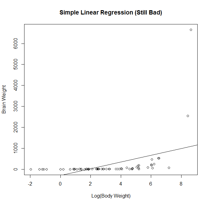 We attempt a log transformation of the independent variable to remove some of the skew. This actually makes the fit significantly worse. Now we have a negative intercept which doesn’t make sense logically. We also see that the fitted line doesn’t follow the observations very well.
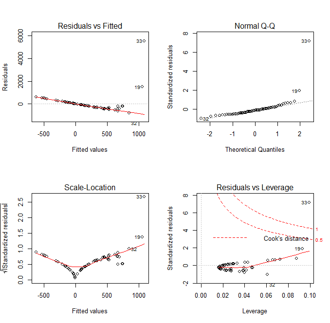 In looking at the diagnostic plots, we see additional problems. The QQ plot has several massive outliers, and the fitted versus residuals line has a very clear pattern. There is clearly another transformation that we haven’t done yet.
Considering that log transforming the dependent variable without transforming the independent variable would just skew the data the other way, another choice we have would be to log transform both independent and dependent variables.
fit3 = lm(log(Brain_Weight) ~ log(Body_Weight), data = data)
par(mfrow=c(1,1))
plot(log(data$Body_Weight),log(data$Brain_Weight),xlab="Log(Body Weight)",
     ylab="Log(Brain Weight)",main="Simple Linear Regression (Good)")
abline(fit3)
par(mfrow=c(2,2))
plot(fit3)
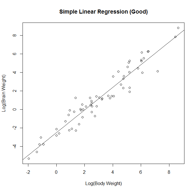
We attempt a log transform of both the independent and dependent variables. Here we can see the data nicely nested around the fitted line. This is ideally the plot we’re looking for in simple linear regression. We see a strong correllation and an interpretable relationship.
 Observing the diagnostic plots we see no obvious patterns in the fitted vs residual plot, and the QQ plot follows the diagonal fairly well. It diverges a bit towards the tails, so there may be a slightly better transformation we could apply, but we can regard this fit as “good enough”.
The final thing to do with this fit is test the model assumptions. We want to confirm the normality of residuals, so we’ll be applying the Shapiro-Wilk test of Normality.
In this test, our null hypothesis is that the residuals are normal, so we are hoping to NOT reject.

If the residuals are not normally distributed, the inferences from the regression will be meaningless. We rely on normality of errors for our inference structures (t and F tests, confidence intervals, etc.). So, applying the test to the residuals of the fit object, we get the results.
shapiro.test(fit3$residuals)
gives us the result.
> shapiro.test(fit3$residuals)

	Shapiro-Wilk normality test

data:  fit3$residuals
W = 0.9874, p-value = 0.7768
With a p-value of 0.7768 being much higher than any  level we might choose to use, we will fail to reject the null hypothesis and we can regard the errors as normal. We will call this our ending model. There are various other methods we could have used to move through the models, but for simple linear regression, plotting and observing the data will give us the best idea of what is going on. We can observe the results of our regression using the summary function. From here, we can also verify that the regression is significant.

The test statistic for this test follows an  distribution. We will observe the results of the test from the summary output.
> summary(fit3)

Call:
lm(formula = log(Brain_Weight) ~ log(Body_Weight), data = data)

Residuals:
     Min       1Q   Median       3Q      Max
-2.16559 -0.59763  0.09433  0.65789  2.09470

Coefficients:
                 Estimate Std. Error t value Pr(<|t|)
(Intercept)      -2.50907    0.18408  -13.63   < 2e-16 ***
log(Body_Weight)  1.22496    0.04638   26.41   < 2e-16 ***
---
Signif. codes:  0 ‘***’ 0.001 ‘**’ 0.01 ‘*’ 0.05 ‘.’ 0.1 ‘ ’ 1

Residual standard error: 0.8863 on 60 degrees of freedom
Multiple R-squared:  0.9208,	Adjusted R-squared:  0.9195
F-statistic: 697.4 on 1 and 60 DF,  p-value: < 2.2e-16
R gives us an F-statistic output of 697, with an associated P-value near 0. With that we can reject the null hypothesis, and accept that there exists a linear relationship between  and
and  . Also note that in simple linear regression with a single predictor value, the F statistic for the overall regression is the square of the t statistic for the significance of the predictor.
  .
.
Now for some math. Taking the log of both sides is in effect performing exponential regression. When we solve the revised equation for the original  , we get this.

And this is the final relationship we arrive at with this data set.